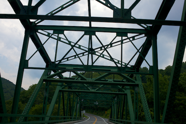
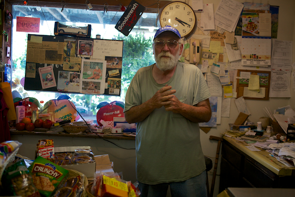
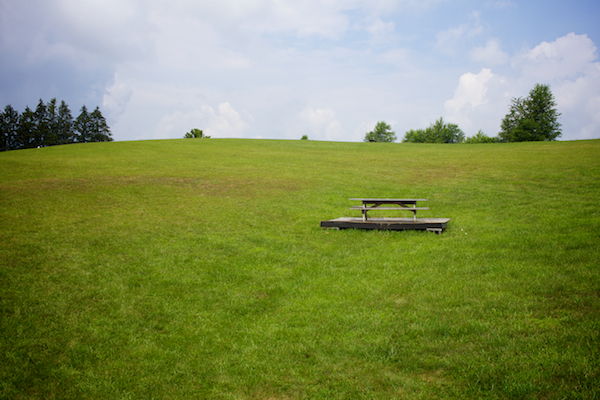
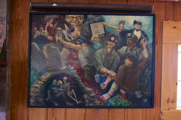
1. Cody and Emily, Pipestem Drive Inn. Pipestem, West Virginia. 2. Sign along Route 20. Pipestem, West Virginia. 3. Lilly Bridge, Bluestone Lake. Hinton, West Virginia. 4. The New River, Summers County. Hinton, West Virginia. 5. Mr. Larry Owens of The Apple Barrel market. Lerona, West Virginia. 6. Flowers and fresh produce at The Apple Barrel market. Lerona, West Virginia. 7. Picnic table on the hill at the Appalachian South Folklife Center. Pipestem, West Virginia. 8. Andy W. Blue's painting at the Appalachian South Folklife Center depicting the tragedies of coal mining and the struggles of labor organizing. Pipestem, West Virginia. 9. iPhone montage (from top to bottom, left to right): 1) Welcome to West Virginia, I77 North coming out of the East River Mountain Tunnel, 2) Dipping my feet in the New River, 3) Sandstone Falls at the New River, 4) Pipestem Drive Inn, 5) Picking black rasberries in Elgood, and 6) Morning light in Elgood.
Appalachia
Sketches from Appalachia
I had an assignment in West Virginia last weekend for a new client. From start to finish, it went remarkably well. I had a great time, met some great people, and got to spend a day in the field with Elaine McMillion, director of Hollow (you should check it out). I look forward to sharing the final piece of the assignment when it's published in a few weeks. Here are some outtakes from the trip.
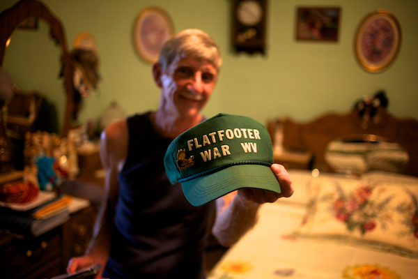
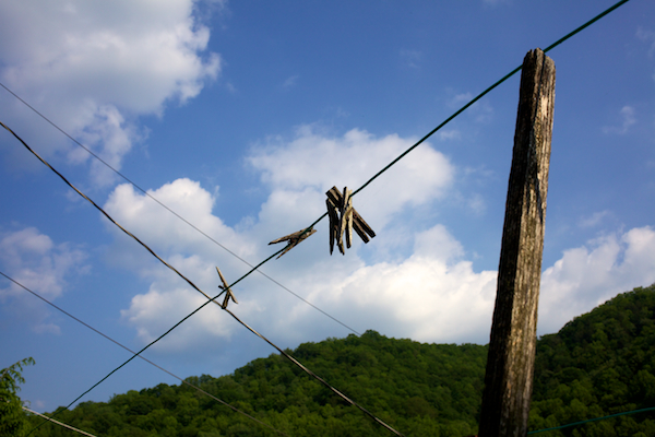
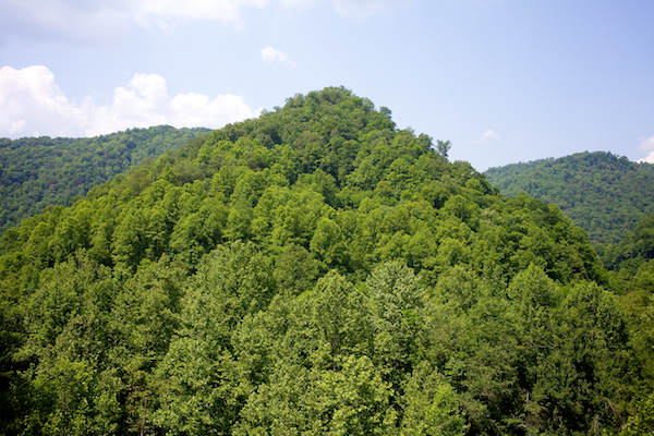
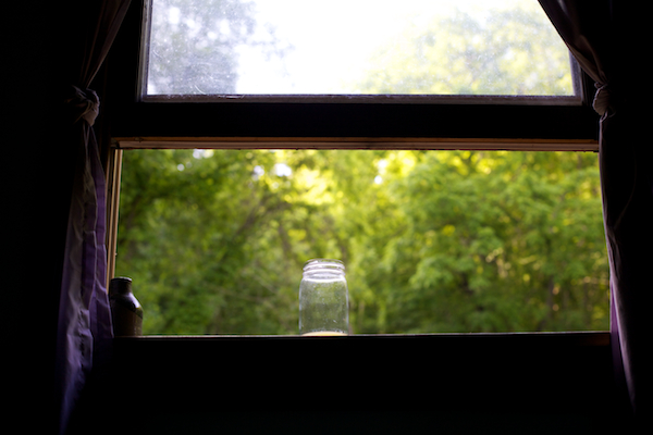
1. Brandon Letner, Bluefield Retread & New Tire Sales. Bluefield, West Virginia. 2. Harrison Street. Princeton, West Virginia. 3. Joe & Anita Kerekes' kitchen window. Berwind, West Virginia. 4. The Kerekes' old home place. Berwind, West Virginia. 5. Manuel Collins, flatfoot dancer. War, West Virginia. 6. Clothesline. War, West Virginia. 7. Soaked with sweat, flatfoot dancer Manuel Collins takes a break in his kitchen. War, West Virginia. 8. Manuel continues dancing in his living room. War, West Virginia. 9. Route 16. McDowell County, West Virginia. 10. Morning light in a mason jar. Elgood, West Virginia.
Perpetuating the Visual Myth of Appalachia – Part Three
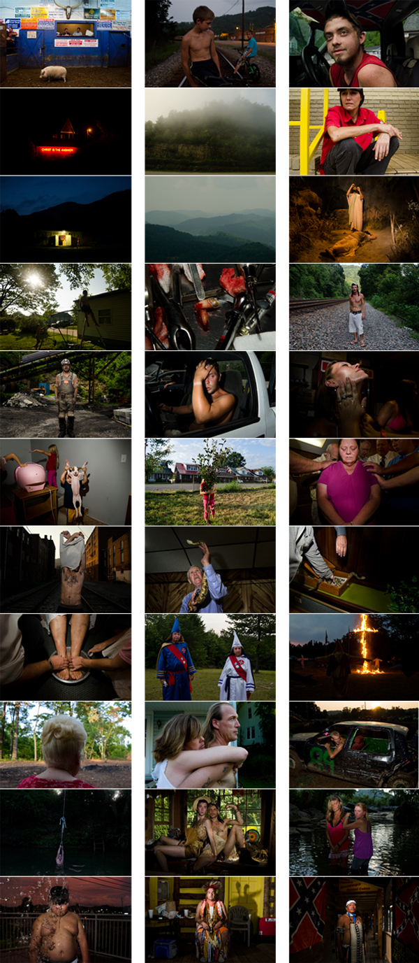
The last couple of weeks have brought about several interesting online conversations about Appalachia and what it actually looks like. While some time has passed since CNN ran Stacy Krantiz's photographs, I think it's important to continue to the conversation about the broader visual representation of Appalachia. Before moving on, I want to share some additional thoughts on the CNN/Kranitz controversy. Last week, Kranitz sent me the 33 photographs she originally submitted to CNN (below). You can see the rest of her series from the project "Old Regular Mountain" here. From these, you get a clearer idea of what she chose to submit. What is still missing, however is why Kranitz chose these specific images.
Here's some of what she had to say about her original submission:
CNN asked for me to send images to choose from. They did not specify the amount. I sent 33 images. I sent two options for: Cherokee, North Carolina, the Snake Handlers in Jolo, Scenic views of the mountains, Old Regular Baptists, swimming holes, and the Klan - because I thought they were important representations to include.
CNN front-loaded their edit with, in my opinion, a sequence of images that set up the ensuing controversy that, let's face it, everyone expected. Was their goal to be controversial? Probably. Have they received a lot of clicks (by the way, clicks = advertisements = revenue) and comments about this picture story? Yes. One of the important things I've learned in writing about this specific instance (and there are many others) is that my own expectation of the media is unrealistic. I have gradually, and lazily, allowed myself to expect the truth from mass media, which is abhorrent and a whole different series of blog articles. Moving on...
In the days following, Kranitz said:
The photo editors at CNN responded and showed genuine concern for my desire to have the project presented in a way that was true to my intentions. While so much of the damage has already been done with so many people seeing the original sequence of images I appreciated that the editors where immediately responsive to my desires to change the edit to be more accurate to the project.
And the 16-image re-edit:
Finally, Kranitz has been nothing but transparent with me about the process and has taken responsibility (rightly so) for the fallout. I think there's something to be said for that. In all of this, the only public acknowledgement from CNN I've been able to locate is in an article by Poynter's Steve Myers:
CNN spokeswoman Erica Puntel said that CNN.com had chosen 16 of the 33 images Kranitz submitted, and that someone from CNN called to listen to her concerns. Puntel said by email:
[Kranitz] said that she had received a large amount of negative feedback and was concerned. She also said that she felt that the edit of the photographs did not represent her work in the way she had intended.
After some discussion, we agreed with her point that some people could misconstrue what she was trying to convey, and therefore, we changed it.
We must not overburden photography with something it cannot do - providing us with an accurate portrayal of anything. Instead, we must acknowledge the maker’s hand, and we should talk about its role - and our reactions.
But what about the framework of how we "look at" Appalachia? How has our view (yours and mine) been constructed? I think most of how we see pictures from Appalachia today coincide with the early War on Poverty images. Poor, white (and black) folks, shoeless, dirty, toothless, destitute. Charles Kuralt's 1964 CBS feature "Christmas in Appalachia" comes to mind. Any honest look at Appalachia would yield those sorts of pictures at any point in time. Pretending that poverty doesn't exist, or choosing not to photograph the systemic issues of poverty, don't simply make them nonexistent. Nor do they accurately represent a place as a whole.
Perhaps the intent of some of the historical images of Appalachia are more of a survey of poverty rather than a survey of Appalachia. But I think somewhere our cultural and visual lexicon has made the two synonymous; Poverty = Appalachia and Appalachia = Poverty. In order to deconstruct that myth, it's important to understand how it was constructed, which can't be done unless we take a long look at the history of extractive industry in Appalachia. Human resources have always been of lesser importance than the natural in Appalachia. Coal and timber have trumped, and continue to trump, the welfare of the people.
John Edwin Mason noted, in a recent email discussion, that at the time of the earlier Appalachian photographs, folks "weren't perhaps as sensitive to questions of representation as we are now." He pointed out that "War On Poverty photographers were overtly engaged politically --on the side of the angels, as people like me would see it."
And certainly photographs were being made in Appalachia prior to 1964.
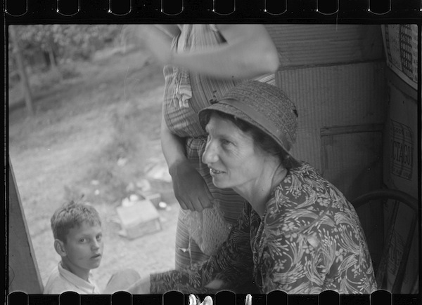
Walker Evans - Farm woman in conversation with relief investigator, West Virginia, 1935.
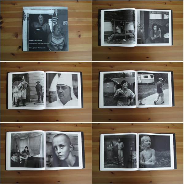
Since the controversy of CNN's edit of Stacy Kranitz's photographs, I've taken a lengthy look at some of the Appalachian photobooks I have on my shelf in an effort to compare and contrast different photographer's work in the region. This is by no means a complete list, but by spending some time in the four books listed below, some common themes about how Appalachia is represented emerged. For example, three of the four photographers are not from Appalachia (insider vs. outsider). Two of the four books include images of the KKK (stereotypical). None of these works tell the complete story of Appalachia (nor would I suspect their authors to claim), but rather their own idea and image of Appalachia. I would argue that there are elements of truth in all of these, but as Colberg points out again in "Photography and Place":
Even if we assumed that it was possible to get that infinity of photographs of a place, two people would probably still come to very different conclusions. Just imagine someone living in the place and someone visiting. And that would be just the most obvious difference one could think of. As I’ve already argued elsewhere our perceptions of photography are very much based on what we bring to the table, our personal, cultural, political biases.
Some Appalachian photobooks:
Ken Light's Coal Hollow 2006, University of California Press Hardcover | 152 pages | 11x11"
Rory Kennedy's American Hollow 1999, Bullfinch Press Hardcover | 128 pages | 8.5x11"
Rob Amberg's Sodom Laurel Album 2001, University of North Carolina Press Hardcover | 192 pages | 10x9.5"
Builder Levy's Images of Appalachian Coalfields 1989, Temple University Press Hardcover | 144 pages | 7.5x9.5"
 Moving forward, I'll be writing more about the broader visual representation of Appalachia, looking at more photographs - new and old - from the region, and hopefully fostering good conversation about how and why we look at Appalachia and what that means.
Perpetuating the Visual Myth of Appalachia – Part Two
 ©Stacy Kranitz / CNN Photos
It's been nearly a week since CNN featured the work of photographer Stacy Kranitz on their photo blog, sparking a stream of controversy about the portrayal of Appalachians. Titling the series "Life in Appalachia" was as offensive to viewers as many of the photographs were. Within days, Kranitz spoke to CNN and expressed her concern about the misrepresentation of her work. CNN agreed to replace some of the photographs with less controversial ones, but for many, it was too little, too late.
It's worth noting that, as of this writing, the CNN's story has received 342 comments (pictured in the screenshot above). That's more than any other story since photographer Malgorzata Saniewska's set of photographs of Lady Gaga in "Before she was Gaga: The unseen photos," which ran on 24 February 2012 and received 351 comments. Some of the picture stories CNN featured between the Gaga series and the Appalachia series include children affected by cystic fibrosis (50 comments), rape in Haitian refugee camps (43 comments), a deadly water crisis in India (21 comments), violence in Juarez, Mexico (66 comments), life in war-torn Somalia (62 comments), faces of the Taliban (88 comments), Liberian civil war (7 comments), and remembering the Bosnian war 20 years later (39 comments).
What does this tell us? For me, (aside from a misplaced fixation on Lady Gaga) it demonstrates the very real power of the visual stereotype many people still have of Appalachia and how vocal people can be when they feel misrepresented. It also demonstrates that CNN saw a huge number of comments, second only to Lady G, in the last several months. I don't want to get into the habit of assuming anything, but since CNN has remained silent on the issue, it's hard not to think they knew what they were doing when they ran the first set of 16 images from Kranitz's series. Again, the CNN editors listed for the series - Robert Johnson and Matthew Rond - haven't made any effort to explain or defend their first edit of Kranitz's images. I learned this evening, during a phone interview with Kranitz, that CNN Digital's Director of Photography, Simon Barnett, was the person responsible for making the changes to the series, which is what viewers now see, not the original edit. According to Kranitz, he asserted how much he cared about his photographers and wanted her to make sure he understood that the first edit wasn't true to her intentions for the project.
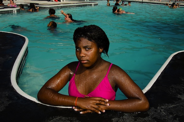
Of the pictures that didn't make it into either edit, I really wish the picture above would've been included. It's the only African-American featured in any of the photographs from the "Old Regular Mountain" series. I'm partial to it because of it's composition, dramatic lighting, framing and pose of the young woman. This image wasn't one of 33 Kranitz submitted to CNN after they contacted her about the project. I asked Kranitz why the image didn't make the cut. She explained, rather honestly, that not very much time was spent on preparing the edit to submit, and that she wasn't very good at editing her own work. (I can attest to not being very good at editing my own work either.)
Of the 33 images Kranitz submitted to CNN, two were of the KKK. They selected two KKK images for their 16-image run. I'm not certain why Kranitz chose to submit two of these images, but it begs the question - Is it a coincidence CNN selected two photographs that, by their very nature lend themselves to controversy, for such a short photo essay? What was the intent of the editors? Until someone from CNN provides an explanation, we won't truly know. We know Kranitz, unhappy with the selection, replaced five images. Kranitz sent me her original submission to CNN - all 33 photographs. She also sent me the five images later replaced by CNN. What I don't have is a record of CNN's first edit, so if anyone reading this by chance has that, please contact me. I'd like to run the two edits side-by-side at some point.
I asked Kranitz if she had any record of the first edit by CNN in an email earlier today. Following are excerpts of her email as well as some other points I think are key to this conversation:
- Unfortunately, I did not make a record of the original CNN edit. I only remember it opening with the KKK cross burning followed by a Holiness Pentecostal snake handler image. I remember this being followed by several images that represented different types of christianity in the region. Unfortunately because they followed a cross burning and snake handler photograph they looked like representations of extreme fundamentalism instead of different aspects of how christianity is practiced in Appalachia. The Old Regular Baptists are unique to this area and their numbers are dwindling just like the Holiness Pentecostal snake handling churches. They each offer very different interpretations of the bible for their followers. The Old Regular Baptists do not handle snakes and the Holiness Pentecostal churches do not participate in a foot washing ceremony. In my larger edit of 77 images they are given more room to be independent representations but in the 16 image edit it is harder to see them as separate religious practices.
- The woman being oiled up is not a stripper. She was a participant in a bikini contest at a local bar.
- When the editors agreed to revise the edit to better fit my intentions, they invited me to send them the changes that I wanted to see. I focused on reordering the images and removing one of the Klan photos, two of them was not necessary for such a small edit. I then removed the bikini contest photo because people were confusing it for an image of a stripper. I also removed one of the religious images because I felt that CNN had originally chosen too many. I replaced those images with an image of coal miner, a young boy in a river and my friend Steve with his x-girlfriend.
- I wanted to make as few changes as possible. The main failure was the arrangement and front-loading of such provocative images. It made it impossible to view the other images with any objectivity. With just some minor tweaking I felt that it was possible to redirect the criticism and frustration to a more legitimate place. The dialogue and criticism taking place surrounding the images is important. I am in the very early stages of the project so it seems reasonable for their to be major failures in the work.
Kranitz continues in her email to make some interesting points and asks an important question:
Because I am in the early stages of a project that will likely transform, change and look very different as years go by, I value this type of dialogue and all of the confusion that has occurred this week. It allows me to do what I want most. To reflect on the power of the image to think about the capabilities of the documentary tradition and make work that not only continues this tradition but comments on its limitations and influence. I am currently in the process of thinking about new experiments, questions and methodologies for my upcoming trip. I leave in less than a month to return to the region.
With this in mind, I am interested in having a dialogue about alternative approaches to photography in the area. I am not making a travel brochure. Those already exist. I am an outsider and therefore my relationship to the area is different from someone who grew up there. Is there a place for outsider depictions of Appalachia or should this type of project only be done by someone who has lived there?
What do you think?
In the week since CNN ran her photographs, Kranitz has dealt head-on with questions about her work. "As difficult as it's been, it's been very valuable to me as a photographer," she said. She'll continue to work the "gray areas" as she calls them, the challenging spaces of demystifying stereotypes and realizes that not everyone will understand or appreciate what she's doing. She's heading back to Appalachia for a four-month trip soon and plans to reconnect with the folks she's photographed there. I asked if any of the those people have contacted her to complain. They haven't. She raises concern about the snake-handling church in Jolo, West Virginia and how they may have been negatively impacted by all this. She plans on having a conversation with them and being clear about what transpired.
Over on Twitter this weekend, I was involved in a conversation with a few photographers about the editorial process of this CNN piece. John Edwin Mason made a statement that fascinated me and I think has some serious weight to the conversation about stereotypes in Appalachia. He said, "Contempt for the white working class is the last acceptable prejudice for (many, not all) middle-class liberals." What do you think about this?
In the next post in this series, I'd like to continue the conversation about visual stereotypes of Appalachia by looking at work from Mary Ellen Mark, Builder Levy, Shelby Lee Adams, William Gedney, and others, and seeing where it shakes out on this issue. As always, your feedback is welcome.


